DIAMOND GALLERY
Version 1.1 Documentation
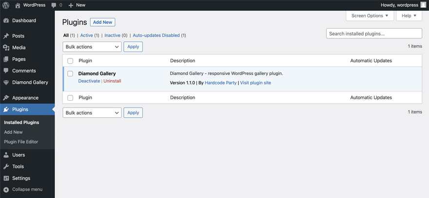
INSTALLATION
Download the plugin ZIP file from CodeCanyon and follow these steps:
- Log into your WordPress Admin area.
- Click Plugins button in the admin menu.
- Click Add new and then Upload plugin.
- Select the plugin ZIP from your PC inside the ZIP you had previously downloaded.
- Install the ZIP and click on Activate Plugin.
If you have upload problems then use an FTP program to access your blog, then browse to
/public_html/wp-content/plugins and upload the unzipped plugin here. Then open the Plugins page and activate the plugin.
GET STARTED
Once you have Diamond Gallery plugin activated you can start creating galleries. Go to plugin admin page by clicking Diamond Gallery on the left hand side of the admin page. Page Diamond Galleries will open. Here you can create and edit galleries.
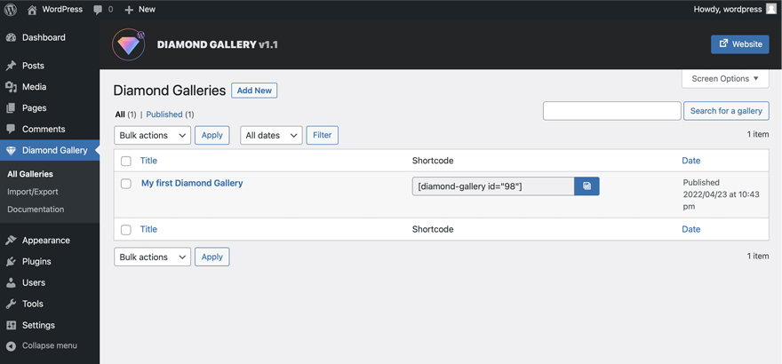
- To create a new gallery click Add New button. Add New Gallery page will open.
- To edit an existing gallery, select it from the list of galleries and click the Edit link in the submenu. Edit Gallery page will open.
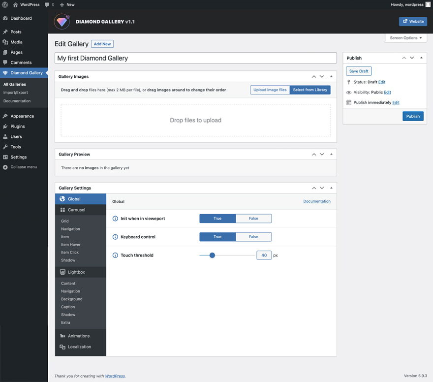
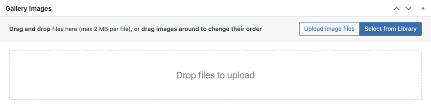
GALLERY IMAGES
The Gallery Images meta box is used to add images to the gallery. Click the Upload image files or Select from Library button and select your images. You can also drag images directly into the meta box. After adding images to the gallery you can drag them to change their order.
To delete an image from the gallery point your cursor over it and click Delete icon.
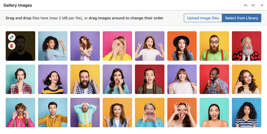
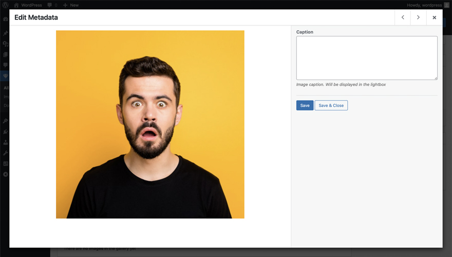
Use Edit button to edit the link or caption of the image. Plugin settings allow you to choose which action will be triggered when you click on the gallery image. There are two options:
- The lightbox will open. In this case, you can add a caption to the image
- The image will act as a link. In this case, you can set a URL to redirect
Point your cursor over an image and click Edit button. Edit popup window will appear. Enter your link or caption and click Save or Save & Close button.
GALLERY PREVIEW
The Gallery Preview meta box shows what your gallery will look like in real time. Each time you make changes to settings or images, the preview will be updated.
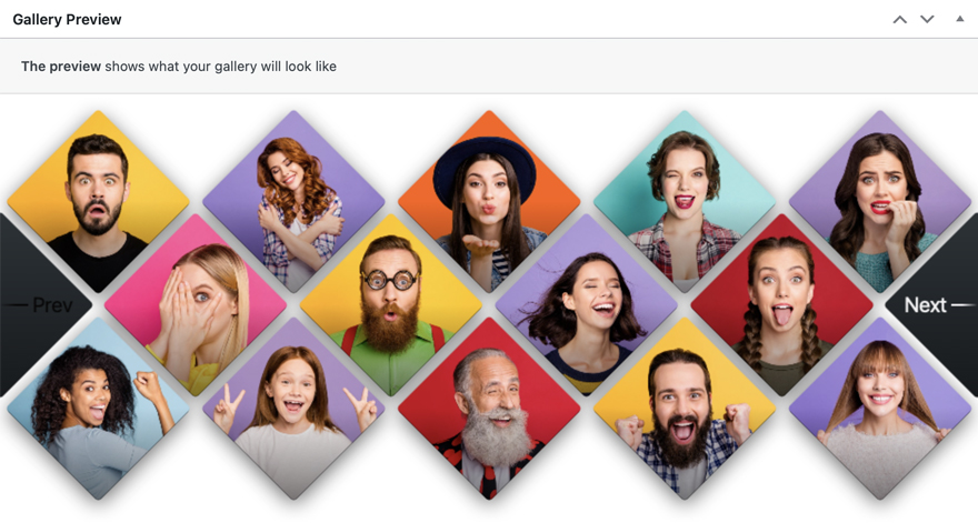
Note that this is a preview only. Depending on your current theme the gallery may look a bit different on the actual post or page.
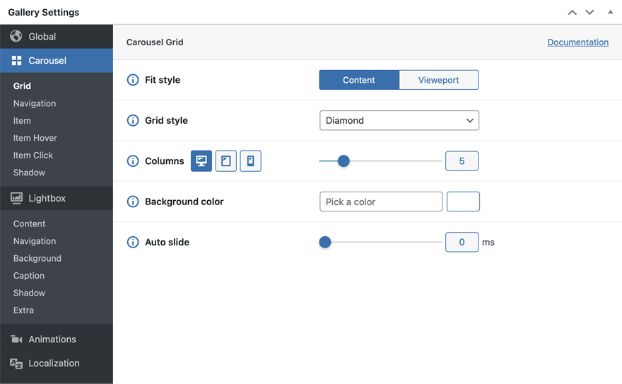
GALLERY SETTINGS
The Gallery Settings meta box is used to customize the gallery. Settings are splitted into logical blocks, such as "Carousel", "Lightbox", etc. to facilitate the customization process. Use the settings panel to navigate to the appropriate settings section.
Each setting is preceded by an "i" icon. Hover over it and a description will appear of how this setting will affect your gallery.
Some settings are responsive and have 3 icons next to them: Desktop, Tablet, Mobile. This means that you can set different values for different devices. For example, the "Columns" setting is responsive, and you can choose how many columns the gallery carousel will display for desktops, tablets, or mobile devices. Click on the device icon and select the value for it.
Here is a complete list of all plugin settings:
GLOBAL
| Setting name | Description |
|---|---|
| Init when in vieweport |
Allows to initialize the plugin only when it appears in the user`s viewport. Useful for increasing page load speed. Set it to False for immediate initialization |
| Keyboard control | Enables gallery navigation using the keyboard. Set to False to disable keyboard control |
| Touch threshold | Minimum distance that user has to swipe to trigger a gallery slide event. Value is in px |
CAROUSEL GRID
| Setting name | Description |
|---|---|
| Fit style |
There are two values: Content and Vieweport. By default, the carousel will fit all the available width of the post or page content. But in case you need a carousel to fit the width of the viewport, and your layout doesn't allow it, set the value to Vieweport and the carousel will fit all the available viewport width no matter what |
| Grid style |
Carousel grid style. There are four available values:
 Diamond
 Tile
Tile
 Ellipse
 Hexagon
|
| Columns |
The number of columns in the carousel. Note that this value is responsive |
| Background color |
Carousel background color. Only HEX format is allowed ( for example: '#000000' ) |
| Auto slide |
Time interval in ms for automatic carousel sliding. If set to 0, auto sliding is disabled. Set to 1000 and the carousel will slide automatically every second, up to 5000 - every 5 seconds respectively. Auto sliding will be stopped after user interaction: tap, click or swipe |
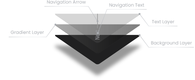
CAROUSEL NAVIGATION
| Setting name | Description |
|---|---|
| Text color |
Carousel navigation buttons text color. This color will also be applied to the navigation arrows. Only HEX format is allowed |
| Disabled text color |
Disabled navigation button text color. This color will also be applied to the navigation arrows. Only HEX format is allowed |
| Font size |
Carousel navigation buttons font size, in px. Note that the plugin will always try to fit the text into the available space, so font size may not always match the set value. Despite the text fitting, font size of both navigation buttons will be always equal. Note that this value is responsive |
| Arrow height |
This value sets the line height for navigation button arrows, in px. Range of values - from 0 to 10. If set to 0, the navigation arrows will be completely removed and the navigation texts will be centered 
|
| Arrow gradient point |
This value sets the transparency point for navigation button arrows gradient in %. Range of values - from 0 to 100 
|
| Background color |
Background color of the carousel navigation buttons. Only HEX format is allowed |
| Gradient color |
Carousel navigation buttons gradient color. Only HEX format is allowed |
| Gradient opacity | The level of opacity of the carousel navigation buttons gradient layer. Value is in %. Range of values - from 0 to 100 |
CAROUSEL ITEM
| Setting name | Description |
|---|---|
| Size |
Carousel item size, in % of the maximum available size. This setting allows to control margins between items. The less the value, the larger margin will be. This value will also be applied to the carousel navigation buttons and is responsive |
| Aspect ratio |
Carousel item aspect ratio. Value set to 1 means that the width and height of the item will be equal. Value less than 1 means that the item will be stretched vertically, more than 1 - horizontally.  1
1
 0.5
0.5
 1.5
1.5
This value will also be applied to the carousel navigation buttons |
| Border radius |
Carousel item border radius, in px. This value will also be applied to the carousel navigation buttons and is responsive |
| Gradient color |
Carousel item gradient layer color. Only HEX format is allowed |
| Gradient point |
The point where the gradient should stop. Will be calculated as a percentage of the item height. If set to 50, the gradient layer will start at the bottom of the item and stop in the middle. Set it to 100 and the gradient layer will cover all the item height and will stop at the top of the item |
| Gradient opacity | Opacity level of the item gradient layer, in %. |
| Image grayscale level |
Grayscale level of the item image, in %. A value of 0 leaves the image full color saturated. Set it to 100 and the image will be black and white |
| Preloader color |
Color of the preloader that appears before the item is loaded. Only HEX format is allowed |
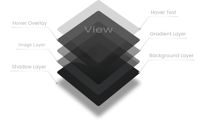
CAROUSEL ITEM HOVER
| Setting name | Description |
|---|---|
| Text color |
Color of the carousel item hover text. Only HEX format is allowed |
| Text opacity | Opacity level of the carousel item hover text, in %. |
| Text font size |
Font size of the carousel item hover text, in px. Note that this value is responsive |
| Text scale |
Initial scale level of the hover text, in %. If the value is less than 0, the text size will decrease, more than 0 - will increase. If set to -100, then the text will be enlarged from half the original size to full size on hover. Set it to 100 and the text will be reduced from double the size to the original on hover |
| Image scale |
Initial scale level of the carousel item image, in %. If the value is less than 0, the initial image size will be enlarged and reduced to the original size while hovering. If set to more than 0, image size will remain original and will be enlarged on hover |
| Image grayscale level |
Grayscale level for carousel item image while hovering, in %. A value of 0 leaves the image full color saturated. Set it to 100 and the image will be black and white |
| Overlay color |
The color of the carousel item hover overlay layer. Only HEX format is allowed |
| Overlay opacity | Opacity level of the carousel item hover overlay layer, in %. |
CAROUSEL ITEM CLICK
| Setting name | Description |
|---|---|
| Carousel item click |
The type of action that will be triggered when the carousel item is clicked.
|
| Default URL |
This URL will be used by default when clicking on carousel items. You can override it by opening edit popup window of each image of the gallery. This setting will be available if Carousel item click is set to Redirect to URL |
| Open URL in |
How to open carousel item URL. There are two values:
This setting will be available if Carousel item click is set to Redirect to URL |
CAROUSEL SHADOW
| Setting name | Description |
|---|---|
| Color |
Color of the carousel shadow layer. Only HEX format is allowed |
| Size |
Size of the carousel shadow, in px. Note that this value is responsive |
| Opacity | Opacity level of the carousel shadow layer, in %. |
| Horizontal offset |
Horizontal offset of the carousel shadow, in %. Positive value puts the shadow on the right side of the carousel item, negative value puts the shadow on the left side of the carousel item |
| Vertical offset |
Vertical offset of the shadow, in %. Positive value puts the shadow below the carousel item, negative value puts the shadow above the carousel item |
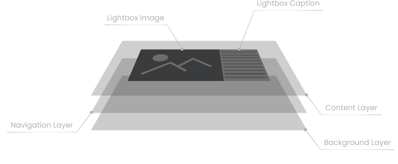
LIGHTBOX CONTENT
| Setting name | Description |
|---|---|
| Scale |
Lightbox content block scale level, in %. If the value is less than 0, the size of the lightbox content block will be increased from the set value to the original size during the opening animation and vice versa if the value is greater than 0 |
| Maximum width |
The maximum allowed lightbox content block width is a percentage of the viewport width. If value is set to 80, any lightbox image including caption won`t be wider than 80% of viewport. |
| Maximum height |
The maximum allowed lightbox content block height is a percentage of the viewport height. If value is set to 90, any lightbox image won`t be higher than 90% of viewport |
LIGHTBOX NAVIGATION
| Setting name | Description |
|---|---|
| Color |
Color of the navigation and close buttons of the lightbox. Only HEX format is allowed |
| Size |
The size of the navigation and close buttons of the lightbox. This value sets buttons size in % of maximum available space for them. Note that this value is responsive |
| Line width | This value sets the line thickness for navigation and close buttons of the lightbox in px. Range of values - from 1 to 20 |
| Gradient point |
This value sets the transparency point for gradient of navigation and close buttons of the lightbox, in %. Range of values - 0 to 100 
|
| Navigation buttons angle |
This value sets the angle of the lightbox window navigation buttons in degrees. Range of values - 20 to 80
|
LIGHTBOX BACKGROUND
| Setting name | Description |
|---|---|
| Color |
Color of the lightbox background layer. Only HEX format is allowed |
| Opacity | The level of opacity of the lightbox background layer, in %. |
LIGHTBOX CAPTION
| Setting name | Description |
|---|---|
| Background color |
Background color of the lightbox caption. Only HEX format is allowed |
| Text color |
Text color of the lightbox caption. By default, text color settings of the page or post will be applied. Only HEX format is allowed |
| Width |
Width of the lightbox caption, in px. In the 'mobile' layout of the lightbox the width of the caption is automatically adjusted according to the image width |
| Vertical padding | Vertical padding of the lightbox caption container. |
| Horizontal padding | Horizontal padding of the lightbox caption container. |
| Minimum height |
Minimum height of the lightbox caption, in px. Will be applied to 'desktop' lightbox layout |
| Minimum width |
Minimum width of the lightbox caption, in px. Will be applied to 'mobile' lightbox layout |
| Mobile view point |
The size of the viewport in px when the lightbox should be switched to the mobile layout. For the adaptation ability there are two layouts of a lightbox: 'desktop' and 'mobile'. For example, if the value is set to 800, screens are larger than 800px will display a 'desktop' layout of the lightbox and smaller than 800px - 'mobile' layout  'desktop' layout - 800px
 'mobile' layout - 700px
|
LIGHTBOX SHADOW
| Setting name | Description |
|---|---|
| Color |
Color of the lightbox content block shadow. Only HEX format is allowed |
| Size |
Size of the lightbox content block shadow, in px. Note that this value is responsive |
| Opacity | Opacity level of the lightbox content block shadow, in %. |
| Horizontal offset |
Horizontal offset of the shadow, in %. Positive value puts the shadow on the right side of the lightbox content block, negative value puts the shadow on the left side of the lightbox content block. |
| Vertical offset |
Vertical offset of the shadow, in %. Positive value puts the shadow below the lightbox content block, negative value puts the shadow above the lightbox content block |
LIGHTBOX EXTRA
| Setting name | Description |
|---|---|
| Additional class | This setting will add an additional HTML class to the lightbox. |
| z-index | CSS z-index for the lightbox. |
ANIMATIONS
| Setting name | Description |
|---|---|
| Transition speed | Global transitions speed. Value is in ms |
| Transition animation |
The type of the easing function for transition animations. The easing functions specify the rate of change of a parameter over time. More information can be found in the easing functions section of the current documentation |
| Allow hover | Allows hover events. Set it to false to disable hover |
| Hover speed | Global hover speed. Value is in ms |
| Hover animation |
The type of the easing function for hover animations. The easing functions specify the rate of change of a parameter over time. More information can be found in the easing functions section of the current documentation |
LOCALIZATION
| Setting name | Description |
|---|---|
| "Prev" button | The text of the carousel "Previous" navigation button |
| "Next" button | The text of the carousel "Next" navigation button |
| Item hover text | Carousel item hover text |
SAVE / UPDATE
To save the gallery, click the Publish button in the Publish meta box.
To update the gallery, click the Update button in the Publish meta box.
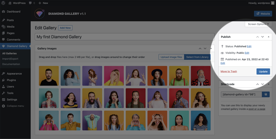
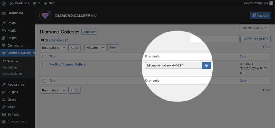
SHORTCODE
Use the shortcode to display the gallery inside a post or page. After publishing the gallery, you can copy your shortcode from the Shortcode meta box on the Edit Gallery page or from the Diamond Galleries page directly.
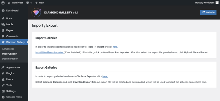
IMPORT / EXPORT
To import or export galleries go to plugin Import/Export admin page and follow the instructions.
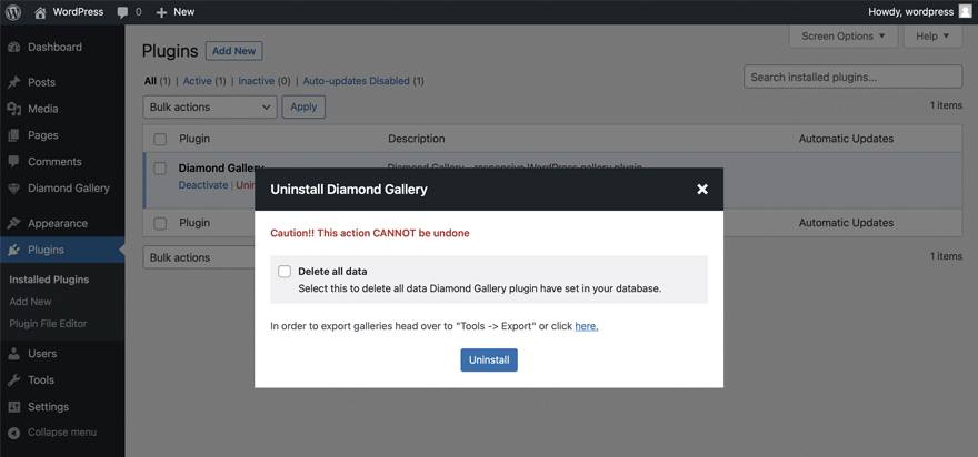
UNINSTALLATION
Once you have the plugin activated you can run uninstallation process. This action will delete all data Diamond Gallery plugin have set in your database.
- Go to plugins admin page by clicking Plugins on the left hand side of the admin page.
- Find Diamond Gallery in the plugins list and click Uninstall in the submenu.
- Check Delete all data in the popup window and click Uninstall button.
EASING FUNCTIONS
The easing functions denotes a mathematical function that describes how fast one-dimensional values change during animations. This lets you vary the animation's speed over the course of its duration. They can be used to smooth down the start and end of the animation.
For a better understanding, let's look at three different functions: linear, easeInSine and easeInOutSine to compare and describe them. In the graphs, the X axis represents the time and the Y axis - the output value:
 linear
In the 'linear' function, the animation moves from the beginning to the end at a constant rate which means that the value will increase by an equal amount. In other words, if you need to move an object 10 pixels in 10 seconds and you use a linear function, that object will move 1 pixel every second.
 easeInSine
In the 'easeInSine' function, the animation starts slowly, and then progressively speeds up until the end.
 easeInOutSine
In the 'easeInOutSine' function, the animation starts slowly, accelerates sharply, and then slows gradually towards the end.
Here is a complete list of easing functions (except basic one - linear) that you can use in the Diamond Gallery.
easeInSine
 easeOutSine
easeInOutSine
easeOutSine
easeInOutSine
 easeInQuad
 easeOutQuad
 easeInOutQuad
 easeInCubic
 easeOutCubic
 easeInOutCubic
 easeInQuart
 easeOutQuart
 easeInOutQuart
 easeInQuint
 easeOutQuint
 easeInOutQuint
 easeInExpo
 easeOutExpo
 easeInOutExpo
 easeInCirc
 easeOutCirc
 easeInOutCirc
 easeInBack
 easeOutBack
 easeInOutBack
 easeInElastic
 easeOutElastic
 easeInOutElastic
 easeInBounce
 easeOutBounce
 easeInOutBounce