DIAMOND GRID
Version 1.0 Documentation
INSTALLATION
Download the plugin, then upload diamond-grid.min.css and diamond-grid.min.js files from the source folder to your server.
Include diamond-grid.min.css in your page (usually in the head section)
<!-- Main Diamond Grid CSS file -->
<link rel="stylesheet" href="path-to-file/diamond-grid.min.css" type="text/css">
Include diamond-grid.min.js file in your page right below jQuery. Note that this plugin requires jQuery 3.0+
<!-- Plugin requires jQuery 3.0+ -->
<!-- If you already have jQuery on your page, you shouldn't include it again -->
<script src="https://code.jquery.com/jquery-3.6.0.min.js"></script>

<!-- Main Diamond Grid JS file -->
<script src="path-to-file/diamond-grid.min.js"></script>
BASIC USAGE
Create a new <div> tag with unique id and add it to the <body> section of your page.
<!-- This is your new grid -->
<div id="my-diamond-grid"></div>
INITIALIZATION
To init the plugin, include this script below in your page (usually at the bottom of the <body> tag, under jQuery and source script included previously).
<script>
    $(document).ready(function(){
        $("#my-diamond-grid").diamondGrid();
    });
</script>
IMAGES
To add an image, just add HTML markup to your grid. Create a <div> element and specify the path to your image using the data-diamond-grid-image attribute.
<!-- This is your grid -->
<div id="my-diamond-grid">
    <!-- Put your images here -->
    <div data-diamond-grid-image="path-to-image/1.jpg"></div>
    <div data-diamond-grid-image="path-to-image/2.jpg"></div>
    <div data-diamond-grid-image="path-to-image/3.jpg"></div>
</div>
BLANK ITEMS
You can use blank items to form various shapes with your grid. Just add an empty <div> tag to your grid HTML. The plugin will skip this item and leave a blank space in the grid.
<!-- This is your grid -->
<div id="my-diamond-grid">
    <!-- Your image -->
    <div data-diamond-grid-image="path-to-image/1.jpg"></div>
    <!-- Blank item -->
    <div>div>
    <!-- Your image -->
    <div data-diamond-grid-image="path-to-image/1.jpg"></div>
</div>
CLICK ACTIONS
Depending on plugin settings, there are three types of actions that can be triggered on grid item click:
- lightbox - the lightbox will open
- redirect - grid item will act as a link and you will be redirected to the specified URL
- none - clicking events over grid items will be disabled
If you choose the redirect option, you will need to add an attribute to the grid item with a redirect link.
<!-- This is your grid -->
<div id="my-diamond-grid">
    <!-- Your image with a redirect link provided -->
    <div
    	data-diamond-grid-image="path-to-image/1.jpg"
    	data-diamond-grid-url="https://codecanyon.net">
    </div>
</div>
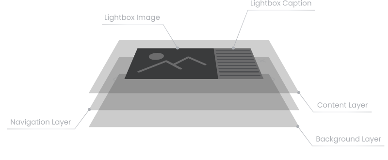
LIGHTBOX CAPTIONS
You can add a caption to each image in your grid and it will appear in the lightbox. Just put your caption HTML layout inside the <div> object.
<!-- This is your grid -->
<div id="my-diamond-grid">
    <!-- Your image -->
    <div data-diamond-grid-image="path-to-image/1.jpg">
    	<!-- Your caption data goes here -->
    	<p>This is my awesome image</p>
    </div>
</div>
OPTIONS
Use options to configure the plugin. Options should be passed to the initialization code and separated by comma. As an example, set some options as shown in the code below.
<script>
    $(document).ready(function(){
        $("#my-diamond-grid").diamondGrid({
            // options go here
            gridStyle: 'diamond',
            gridColumns: 5,
            gridItemSize: 96,
            // and so on...
        });
    });
</script>
In the tables below you can find a complete list of existing options, their default settings and descriptions. The list is separated into the logical blocks for best comprehensiveness
GLOBAL
| Option | Default Value | Description |
|---|---|---|
| lazyLoading | true |
Allows to load images only when they appears in the user`s viewport. Useful for increasing page load speed. Set to false to load all images during plugin initialization |
| fontFamily | null |
Allows to set a specific font to the hover text of grid items and lightbox caption. By default, the plugin applies the font settings from the parent tag <div> to which it is attached. To apply custom font it must be installed on the page. Option must be passed as string: 'My-font-name' |
| transitionSpeed | 250 | Global transitions speed. Value is in ms |
| transitionTimingFunction | 'linear' |
The type of the easing function for transition events. The easing functions specify the rate of change of a parameter over time. More information can be found in the easing functions section of the current documentation |
| hoverSpeed | 250 | Global hover speed. Value is in ms |
| hoverTimingFunction | 'linear' |
The type of the easing function for hover events. The easing functions specify the rate of change of a parameter over time. More information can be found in the easing functions section of the current documentation |
GRID
| Option | Default Value | Description |
|---|---|---|
| gridStyle | 'diamond' |
Grid style type. There are four available values:
 'diamond'
 'tile'
 'ellipse'
 'hexagon'
|
| gridFillEdges | false |
Whether to fill edges of shifted rows  false
false
 true
true
|
| gridRowsToShift | 'even' |
Whether to shift odd or even rows  'even'
 'odd'
'odd'
|
| gridPosition | 'inline' |
Grid position type. There are two possible values:  'inline'
 'outline'
By default, the grid will fit all the available width of the element to which the plugin is attached. In other words, you can adjust the width of the grid by setting the CSS "width" property for the grid tag But in case you need a grid to fit the width of the viewport, and your layout doesn't allow it, set the value to 'outline' and the grid will fit all the available viewport width no matter what |
| gridColumns | 5 |
The number of columns in the grid. Note that the plugin is responsive, so this value can be changed dynamically using breakpoints option |
GRID ITEM
| Option | Default Value | Description |
|---|---|---|
| gridItemSize | 100 |
Grid item size, in % of the maximum available size. This option allows to control margins between grid images. The less the value, the larger margin will be. This value can be dynamically changed using breakpoints option |
| gridItemAspectRatio | 1 |
Grid item aspect ratio. Value set to 1 means that the width and height of the item will be equal. Value less than 1 means that the item will be stretched vertically, more than 1 - horizontally. Minimum value is 0.1.  1
1
 0.5
0.5
 1.5
1.5
|
| gridItemBorderRadius | 0 |
Grid item border radius. Value is in pixels. This value can be dynamically changed using breakpoints option |
| gridItemGrayscaleLevel | 0 |
Grayscale level of the grid item image, in %. A value of 0 leaves the image full color saturated. Set it to 100 and the image will be black and white |
| gridItemPreloaderColor | '#000000' | Color of the preloader that appears before the grid item is loaded. Only HEX format is allowed |
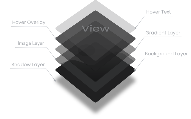
GRID ITEM GRADIENT
| Option | Default Value | Description |
|---|---|---|
| gridItemGradientColor | '#000000' | Grid item gradient color. Only HEX format is allowed |
| gridItemGradientOpacity | 50 |
Opacity level of the grid item gradient layer, in %. Range of values - from 0 to 100 |
| gridItemGradientPoint | 50 |
The point where the gradient should stop. Will be calculated as a percentage of the grid item height. If set to 50, the gradient layer will start at the bottom of the grid item and stop in the middle. Set it to 100 and the gradient layer will cover all the grid item height and will stop at the top |
GRID ITEM HOVER
| Option | Default Value | Description |
|---|---|---|
| gridItemHover | true | Allows hover events over grid items. Set it to false to disable hover |
| gridItemHoverGrayscaleLevel | 100 |
Grayscale level for grid item image while hovering, in %. A value of 0 leaves the image full color saturated. Set it to 100 and the image will be black and white |
| gridItemHoverText | 'View' | Grid item hover text |
| gridItemHoverFontSize | 28 |
Font size of the grid item hover text. Value is in pixels This value can be dynamically changed using breakpoints option |
| gridItemHoverTextColor | '#e2e2e2' | Color of the grid item hover text. Only HEX format is allowed |
| gridItemHoverTextOpacity | 80 |
Opacity level of the grid item hover text, in %. Range of values - from 0 to 100 |
| gridItemHoverTextScale | 20 |
Initial scale level of the hover text, in %. If the value is less than 0, the text size will decrease, more than 0 - will increase. If set to -100, then the text will be enlarged from half the original size to full size on hover. Set it to 100 and the text will be reduced from double the size to the original on hover |
| gridItemHoverOverlayColor | '#000000' |
The color of the grid item hover overlay layer. Only HEX format is allowed |
| gridItemHoverOverlayOpacity | 60 |
Opacity level of the grid item hover overlay layer, in %. Range of values - from 0 to 100 |
| gridItemHoverImageScale | 10 |
Initial scale level of the grid item image, in %. If the value is less than 0, the initial image size will be enlarged and reduced to the original size while hovering. If set to more than 0, image size will remain original and will be enlarged on hover |
GRID ITEM SHADOW
| Option | Default Value | Description |
|---|---|---|
| gridItemShadowSize | 0 |
Size of the grid item shadow. Value is in pixels This value also could be dynamically changed using breakpoints option |
| gridItemShadowColor | '#000000' |
Color of the grid item shadow layer. Only HEX format is allowed |
| gridItemShadowOpacity | 80 |
Opacity level of the grid item shadow layer, in %. Range of values - from 0 to 100 |
| gridItemShadowOffsetX | 0 |
Horizontal offset of the shadow, in %. Positive value puts the shadow on the right side of the grid item, negative value puts the shadow on the left side |
| gridItemShadowOffsetY | 20 |
Vertical offset of the shadow, in %. Positive value puts the shadow below the grid item, negative value puts the shadow above |
GRID ITEM CLICK
| Option | Default Value | Description |
|---|---|---|
| gridItemClickAction | 'lightbox' |
The type of action that will be triggered when the grid item is clicked. There are three possible values:
|
| gridItemDefaultRedirect | null |
Default URL to redirect. If gridItemClickAction is set to 'redirect' and the clicked grid item does not have a redirect URL attribute, this URL will be used |
| gridItemClickRedirectAttr | 'new' |
Determines how to open the link:
|
LIGHTBOX
| Option | Default Value | Description |
|---|---|---|
| lightboxClass | null |
This option will add an additional class to the lightbox. Must be passed as string: 'my-diamond-lightbox' |
| lightboxZindex | 9000 | CSS z-index for the lightbox |
| lightboxTouchThreshold | 40 | Minimal distance that user has to swipe to trigger a lightbox slide event. Value is in pixels |
| lightboxKeyboardControl | true | Enables lightbox navigation using the keyboard. Set to false to disable keyboard control |
LIGHTBOX BUTTONS
| Option | Default Value | Description |
|---|---|---|
| lightboxShowControls | true | Whether to show lightbox closing and navigation buttons. Set to false to hide buttons |
| lightboxButtonStyle | 'plain' |
Two build-in style types of lightbox buttons are available:  'plain'
 'circle'
You can also set custom button images using the following options: |
| lightboxCloseButtonSource | null |
Source of custom image of lightbox "close" button. The value must be passed as a string: '/img/my-custom-close-button.png' |
| lightboxPreviousButtonSource | null |
Source of custom image of lightbox "previous" button. The value must be passed as a string: '/img/my-custom-previous-button.png' |
| lightboxNextButtonSource | null |
Source of custom image of lightbox "next" button. The value must be passed as a string: '/img/my-custom-next-button.png' |
| lightboxControlButtonsColor | '#888888' |
Color of lightbox closing and navigation buttons. This option can only be applied to built-in lightbox button styles: 'plain' and 'circle' and will not affect custom button images. Only HEX format is allowed |
| lightboxCloseButtonWidth | 34 |
The width of the lightbox close button. This value can be dynamically changed using breakpoints option |
| lightboxNavigationButtonWidth | 34 |
The width of the lightbox navigation buttons. This value can be dynamically changed using breakpoints option |
| lightboxCloseButtonMargin | 40 |
The margin of the lightbox close button. This value can be dynamically changed using breakpoints option |
| lightboxNavigationButtonMargin | 40 |
The margin of the lightbox navigation buttons. This value can be dynamically changed using breakpoints option |
LIGHTBOX CONTENT
| Option | Default Value | Description |
|---|---|---|
| lightboxContentScale | 10 |
Lightbox content block scale level, in %. If the value is less than 0, the size of the lightbox content block will be increased from the set value to the original size during the opening animation and vice versa if the value is greater than 0 |
| lightboxMobileViewPoint | 768 |
The size of the viewport in pixels when the lightbox should be switched to the mobile layout. For the adaptation ability there are two layouts of a lightbox: 'desktop' and 'mobile'. For example, if the value is set to 800, screens are larger than 800px will display a 'desktop' layout of the lightbox and smaller than 800px - 'mobile' layout  'desctop' layout - 800px
 'mobile' layout - 700px
|
| lightboxContentMaximumWidth | 80 |
The maximum allowed width of the lightbox content block as a percentage of the viewport width. If value is set to 80, any lightbox image including caption won`t exceed 80% of viewport width. |
| lightboxContentMaximumHeight | 90 |
The maximum allowed height of the lightbox content block as a percentage of the viewport height. If value is set to 90, any lightbox image won`t exceed 90% of viewport height |
LIGHTBOX CAPTION
| Option | Default Value | Description |
|---|---|---|
| lightboxCaptionWidth | 360 |
Width of the lightbox caption, in pixels. In the 'mobile' layout of the lightbox the width of the caption is automatically adjusted according to the image width |
| lightboxCaptionMinimumWidth | 360 |
Minimal width of the lightbox caption, in pixels. Will be applied to 'mobile' lightbox layout |
| lightboxCaptionMinimumHeight | 360 |
Minimal height of the lightbox caption, in pixels. Will be applied to 'desktop' lightbox layout |
| lightboxCaptionTextColor | null |
Text color of the lightbox caption. By default, text color settings of the <body> tag will be applied. Only HEX format is allowed |
| lightboxCaptionVerticalPadding | 20 |
Vertical padding of the lightbox caption container. The value is in pixels |
| lightboxCaptionHorizontalPadding | 20 |
Horizontal padding of the lightbox caption container. The value is in pixels |
| lightboxCaptionBackgroundColor | '#ffffff' |
Background color of the lightbox caption. Only HEX format is allowed |
LIGHTBOX CONTENT SHADOW
| Option | Default Value | Description |
|---|---|---|
| lightboxContentShadowSize | 20 |
Size of the lightbox content block shadow, in pixels This value also could be dynamically changed using breakpoints option |
| lightboxContentShadowColor | '#000000' |
Color of the lightbox content block shadow. Only HEX format is allowed |
| lightboxContentShadowOpacity | 60 | Opacity level of the lightbox content block shadow, in %. Range of values - from 0 to 100 |
| lightboxContentShadowOffsetX | 0 |
Horizontal offset of the shadow, in %. Positive value puts the shadow on the right side of the lightbox content block, negative value puts the shadow on the left side of the lightbox content block. |
| lightboxContentShadowOffsetY | 20 |
Vertical offset of the shadow, in %. Positive value puts the shadow below the lightbox content block, negative value puts the shadow above the lightbox content block |
LIGHTBOX BACKGROUND
| Option | Default Value | Description |
|---|---|---|
| lightboxBackgroundColor | '#000000' |
Color of the lightbox background layer. Only HEX format is allowed |
| lightboxBackgroundOpacity | 90 | The level of opacity of the lightbox background layer, in %. Range of values - from 0 to 100 |
BREAKPOINTS
| Option | Example | Description |
|---|---|---|
| breakPoints |
breakPoints: {
    // if the grid width is <= 1024px
    1024: {
        gridColumns: 4,
        gridItemHoverFontSize: 30,
        gridItemShadowSize: 18
    },
    // if the grid width is <= 768px
    768: {
        gridColumns: 3,
        gridItemHoverFontSize: 20,
        gridItemShadowSize: 14,
        lightboxCloseButtonWidth: 25
    },
    // if the grid width is <= 480px
    480: {
        gridColumns: 2,
        gridItemHoverFontSize: 16,
        gridItemShadowSize: 10,
        lightboxCloseButtonWidth: 20,
        lightboxContentShadowSize: 10
    }
}
|
This option allows to set different parameters for different responsive breakpoints (grid sizes). Following options can be changed:
breakPoints: {
    800: {
        gridColumns: 5
    }
}
|
PUBLIC METHODS
<script>
    // Example code of using public methods
    $(document).ready(function(){

    	// This is your grid initialization code
        $("#my-diamond-grid").diamondGrid();

        // Open the lightbox and show the grid image by index '0'
        // by clicking an HTML element with a "button" id
        $("#button").on('click', function(){
            $("#my-diamond-grid").diamondGrid('lightboxShow', 0);
        });

        // Cloe the lightbox by clicking an HTML element with a "close" id
        $("#close").on('click', function(){
            $("#my-diamond-grid").diamondGrid('lightboxHide');
        });
    });
</script>
| Method | Arguments | Description |
|---|---|---|
| gridItemAdd |
data position |
The method allows you to dynamically add new images to the grid. As a first argument accepts HTML String or jQuery Object. Second argument is a position where to add the image. There are three possible values:
// Adding new image to the grid
$("#my-diamond-grid").diamondGrid(
    'gridItemAdd',
    '<div data-diamond-grid-image="img/2.jpg"></div>',
    'append'
);
|
| gridItemRemove | item |
The method allows you to dynamically remove images from the grid. As an argument accepts image to remove. Four values are available:
// Removing image from the grid
$("#my-diamond-grid").diamondGrid(
    'gridItemRemove',
    'last'
);
|
| lightboxShow | index |
The method allows you to show the lightbox. As an argument accepts image index. // Show lightbox
$("#my-diamond-grid").diamondGrid('lightboxShow', 0);
|
| lightboxHide | - |
The method allows you to hide the lightbox. // Hide lightbox
$("#my-diamond-grid").diamondGrid('lightboxHide');
|
| destroy | - | Removes all events and clears all grid data including HTML layout |
PUBLIC PROPERTIES
<script>
    // Example code of using public properties
    $(document).ready(function(){

    	// This is your grid initialization code
        $("#my-diamond-grid").diamondGrid();

        // Get the width of the grid
        // by clicking an HTML element with a "get-width" id
        $("#get-width").on('click', function(){
            var width = $("#my-diamond-grid").diamondGrid('getGridWidth');
            console.log(width);
        });
    });
</script>
| Property | Argument | Description |
|---|---|---|
| getGridWidth | - | Returns the width of the grid in pixels |
| getGridHeight | - | Returns the height of the grid in pixels |
| getGridItemsNumber | - | Returns the total number of items in the grid |
| getGridItemOuterWidth | - | Returns the outer width of the grid item in pixels |
| getGridItemOuterHeight | - | Returns the outer height of the grid item in pixels |
| getGridItemWidth | - | Returns the inner width of the grid item in pixels |
| getGridItemHeight | - | Returns the inner height of the grid item in pixels |
| getGridItemShiftX | - | Returns the indentation along the X axis of the grid item. The value is the difference between the outer and inner width of the grid item, divided into two |
| getGridItemShiftY | - | Returns the indentation along the Y axis of the grid item. The value is the difference between the outer and inner height of the grid item, divided into two |
| getGridItemsData | - | Returns plugin data on grid items in JSON format |
| getOption | option name |
Returns an individual option value as string. As an argument accepts option neme. If no argument is provided, returns a list of plugin options in JSON format |
EVENTS
<script>
    // Plugin events example
    $(document).ready(function(){

    	// This is your grid initialization code
        $("#my-diamond-grid").diamondGrid();

        // Set event listener on grid items load
        $("#my-diamond-grid").on('grid_items_loaded', function(event, itemsNumber){
            console.log(event.type, itemsNumber);
        });
    });
</script>
| Event | Argument | Description |
|---|---|---|
| grid_items_loaded |
event itemsNumber |
Fires when all the grid items are loaded |
| grid_item_click |
event itemIndex |
Fires when the grid item is clicked |
| lightbox_open |
event itemIndex |
Fires when the lightbox opening animation ends |
| lightbox_close | event | Fires when the lightbox closing animation ends |
| lightbox_before_slide |
event direction currentItemIndex nextItemIndex |
Fires before the lightbox starts the sliding animation |
| lightbox_after_slide |
event currentIndex |
Fires when the lightbox sliding animation ends |
| reinit | event | Fires after every re-initialization of the plugin |
| destroy | event | Fires when the plugin is destroyed |
EASING FUNCTIONS
The easing functions denotes a mathematical function that describes how fast one-dimensional values change during animations. This lets you vary the animation's speed over the course of its duration. They can be used to smooth down the start and end of the animation.
For a better understanding, let's look at three different functions: linear, easeInSine and easeInOutSine to compare and describe them. In the graphs, the X axis represents the time and the Y axis - the output value:
 linear
In the 'linear' function, the animation moves from the beginning to the end at a constant rate which means that the value will increase by an equal amount. In other words, if you need to move an object 10 pixels in 10 seconds and you use a linear function, that object will move 1 pixel every second.
 easeInSine
In the 'easeInSine' function, the animation starts slowly, and then progressively speeds up until the end.
 easeInOutSine
In the 'easeInOutSine' function, the animation starts slowly, accelerates sharply, and then slows down gradually towards the end.
Here is a complete list of easing functions (except basic one - linear) that you can use in the Diamond Grid.
easeInSine easeOutSineeaseInOutSine
 easeInQuad
 easeOutQuad
 easeInOutQuad
 easeInCubic
 easeOutCubic
 easeInOutCubic
 easeInQuart
 easeOutQuart
 easeInOutQuart
 easeInQuint
 easeOutQuint
 easeInOutQuint
 easeInExpo
 easeOutExpo
 easeInOutExpo
 easeInCirc
 easeOutCirc
 easeInOutCirc
 easeInBack
 easeOutBack
 easeInOutBack
 easeInElastic
 easeOutElastic
 easeInOutElastic
 easeInBounce
 easeOutBounce
 easeInOutBounce